Product page of the VOKA application
VOKA is a centre of eye microsurgery. Doctors of the clinic are engaged in complex diagnostics of vision, laser correction, cataract removal, surgery and other life-changing procedures.
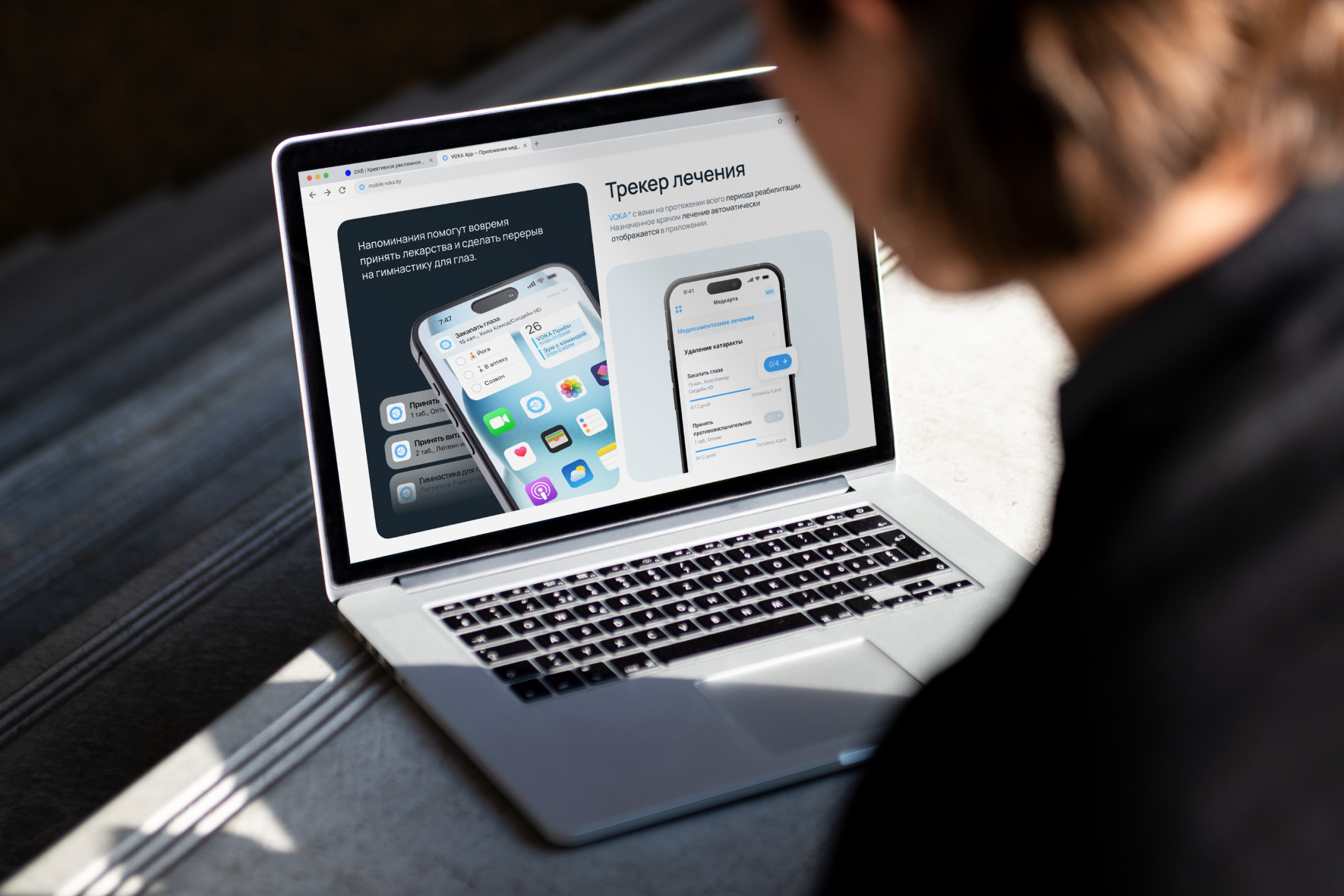
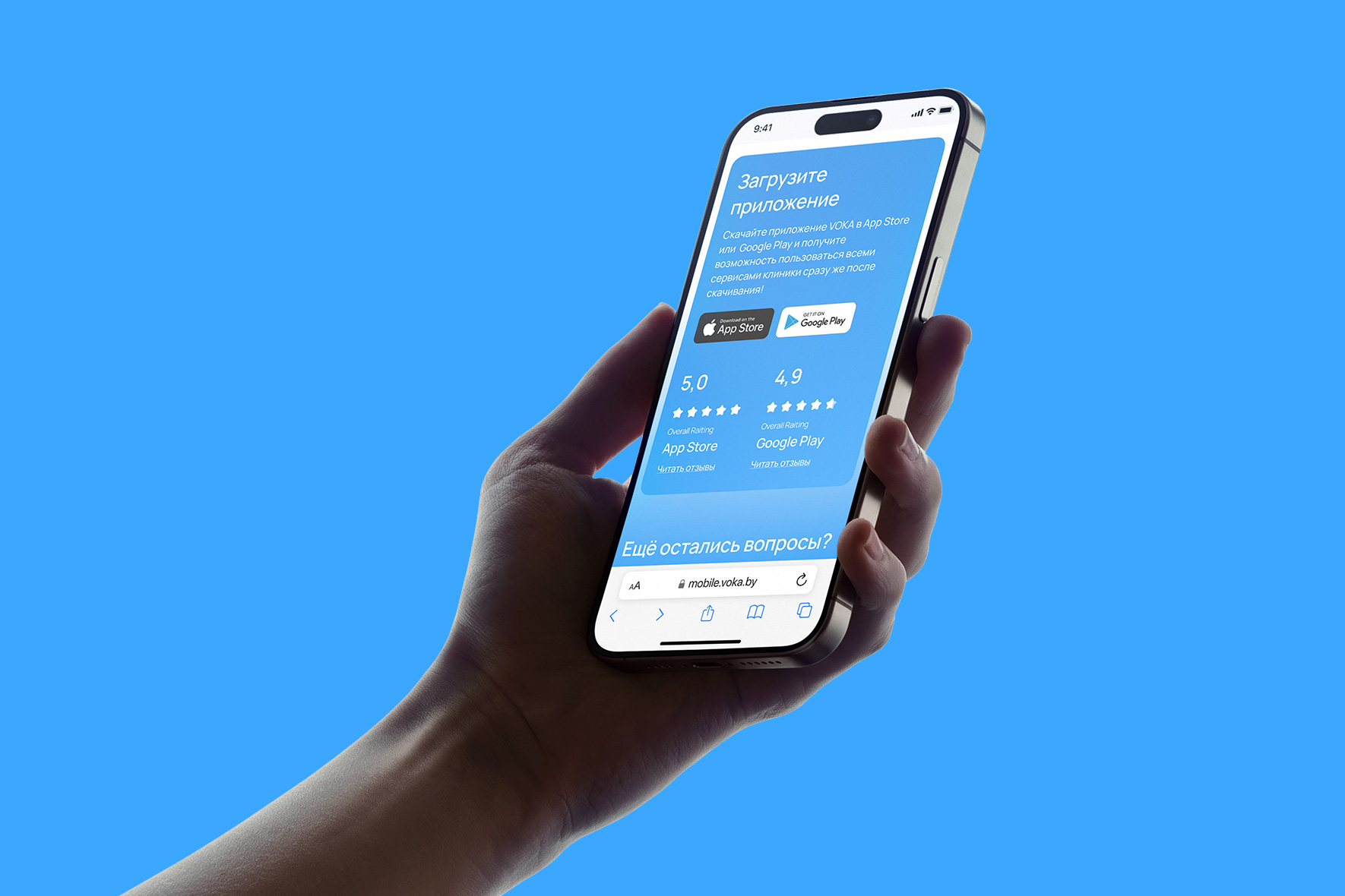
The clinic launched a mobile application to introduce new business processes: appointment management, patient support during rehabilitation, and special offers for frequent patients. We developed a product page, the aim of which was to move the audience from making an appointment via the website or by phone to making an appointment via VOKA App.
Close work with the client allowed us to find out the real benefits of the app, disperse patient scenarios and reflect them in the interface.
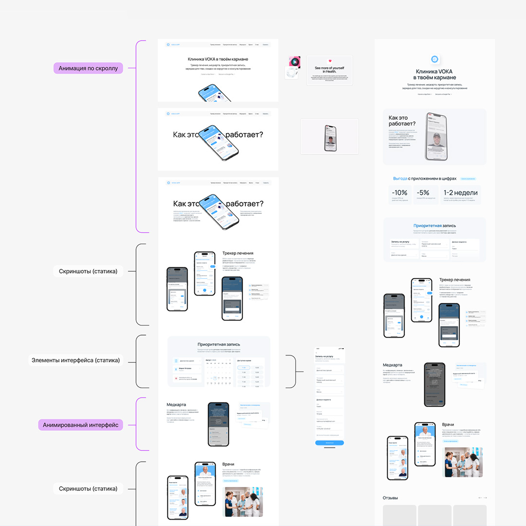
We thought through copywriting and block structure, prepared visuals and animations.
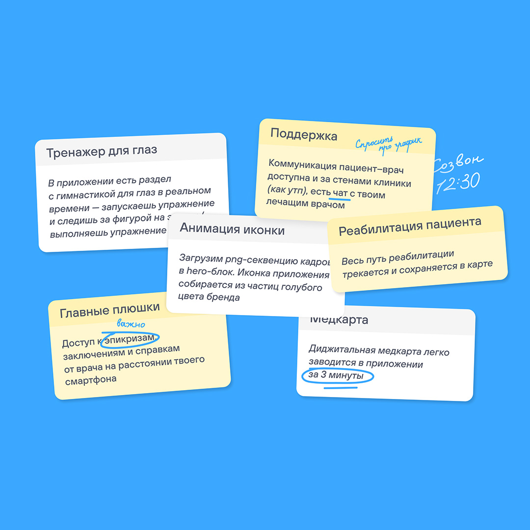
We also secretly made an appointment for a working MVP version of the app, which is already available in stores and gives requests to clinic managers to go through all user paths before ‘selling’ the app to others.
That’s how we found a conflict in the callback script and gave feedback to the client, by the way.
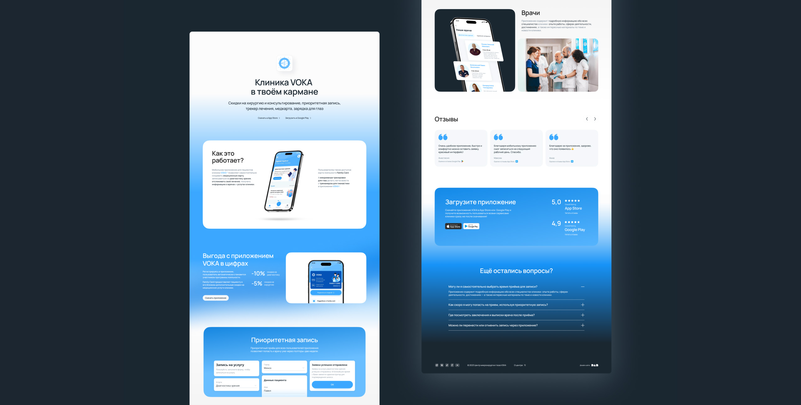
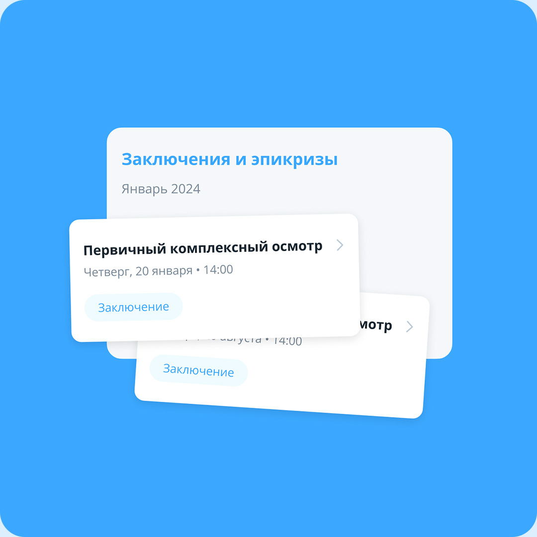
We showed the real usefulness of the app through visuals, allocating for each section of VOKA App its own semantic block on the site. With the help of animation we showed the user not only how the app interface looks like, but also how it works.
For example, the eye gymnastics simulator was added directly to the website.

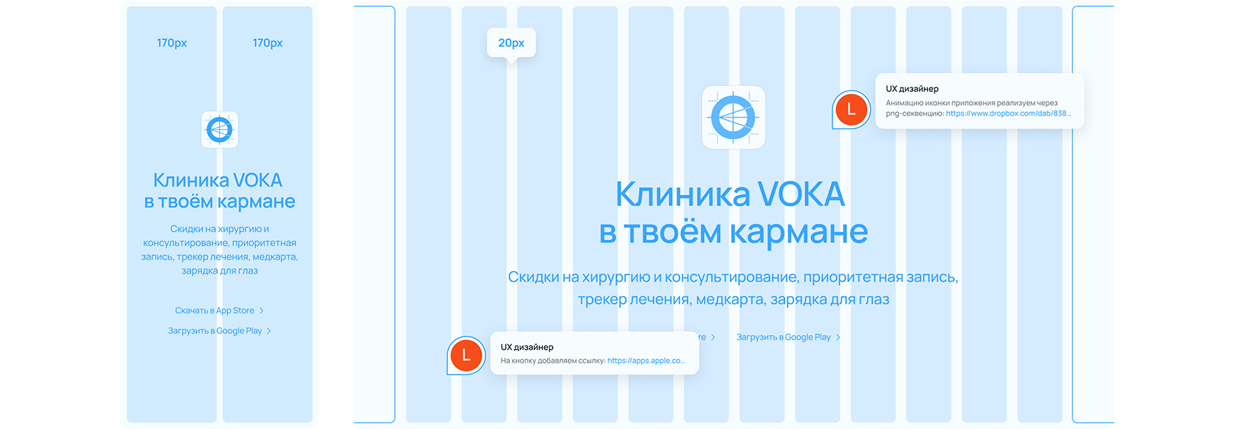
We made adaptive and prepared layouts for development. The layout was done client side.

Easter hacks
VOKA’s patient portrait is a conditional Anastasia from IT, whose work is connected with long visual loads, leads a healthy lifestyle, does a full body checkup once every two years, earns more than 3000 BYN per month.
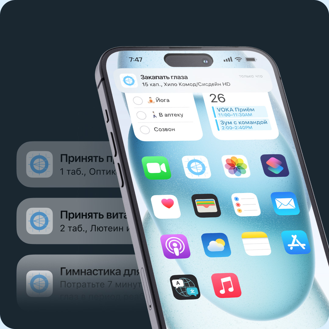
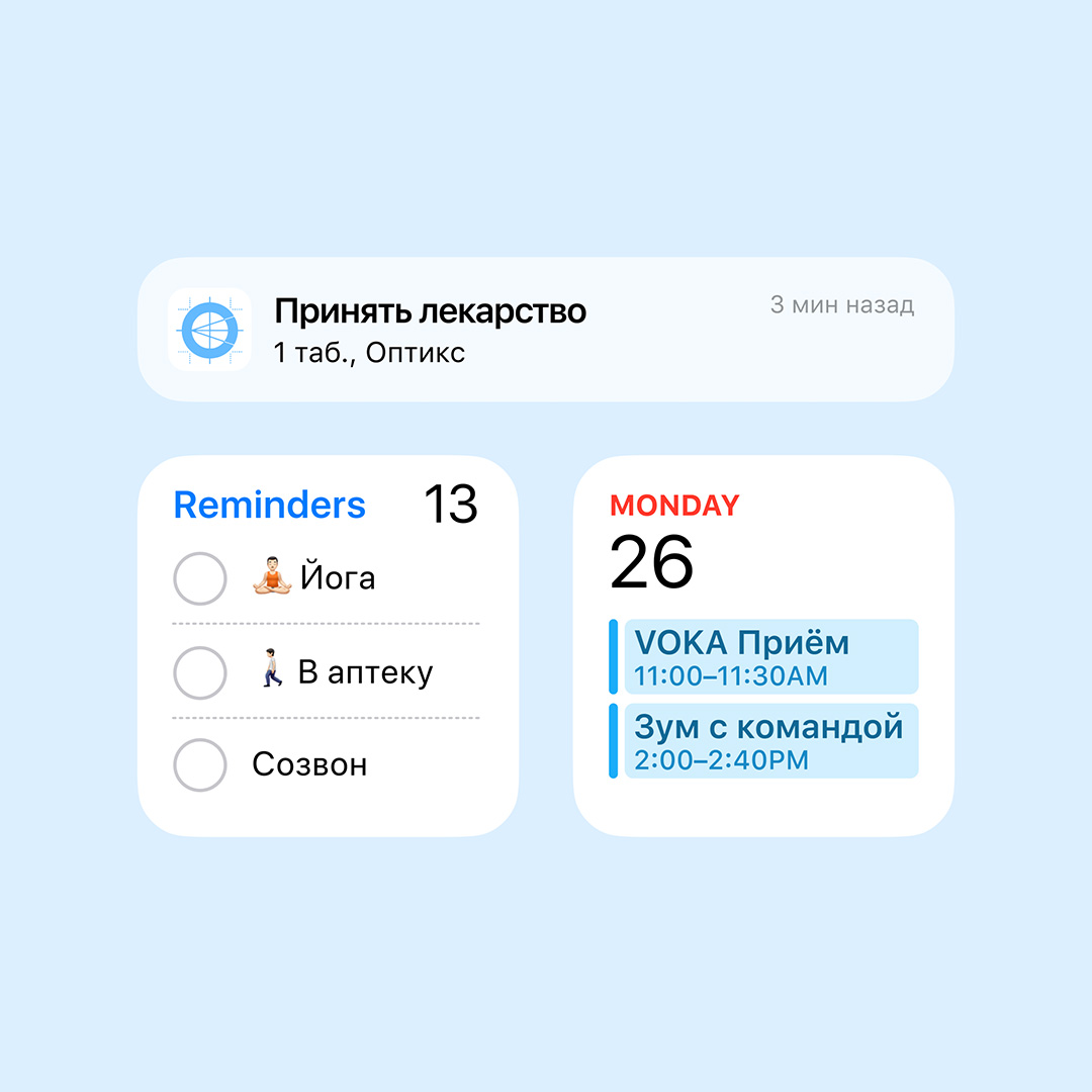
If everything was easy with copywriting, how to add empathy to Anastasia in the visuals of the site, if we show the interface of a particular application?
We put together a visual of the phone’s home screen with a calendar widget reminiscent of a zoom with the team. Well, Nastia’s plans for the day include yoga, a call, and remembering to stop by the pharmacy after work.
Client
Voka
Services
Websites and apps
Analysis
Landing page
Prototyping
Adaptive layout
Mobile app
Date
July, 2024
Let's talk business
Fill out the form and we will contact you. As a rule, this happens during the working day.


