Logistics company identity
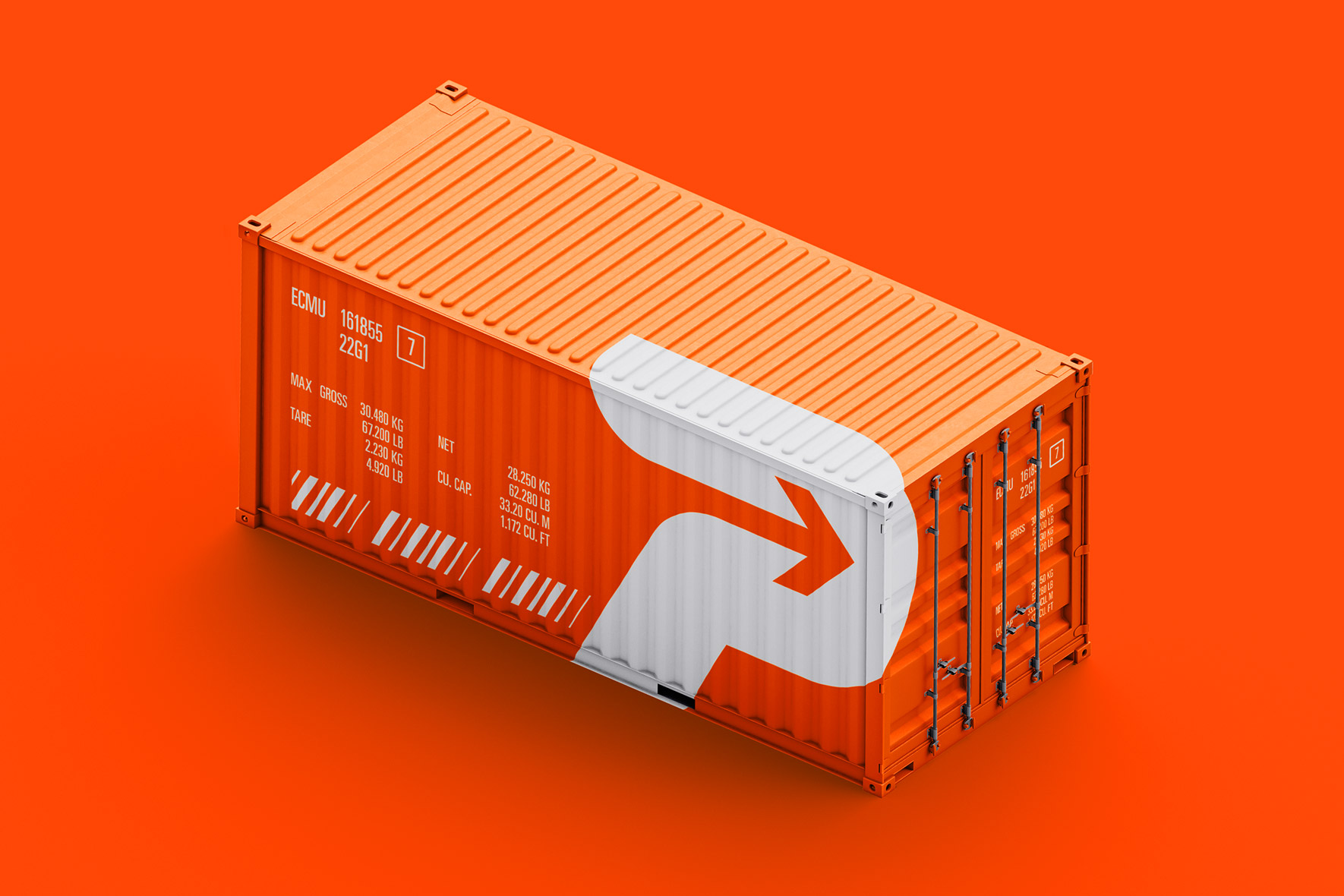
Proimport LLC offers optimized complex logistics services for the processing and delivery of fruits, vegetables, dried fruits, nuts to Russia from Turkey, Egypt, Serbia, Azerbaijan, Iran, Moldova and other countries.
The company operates on the basis of an authorized economic operator, is engaged in the maintenance and execution of permits and phytosanitary certificates.
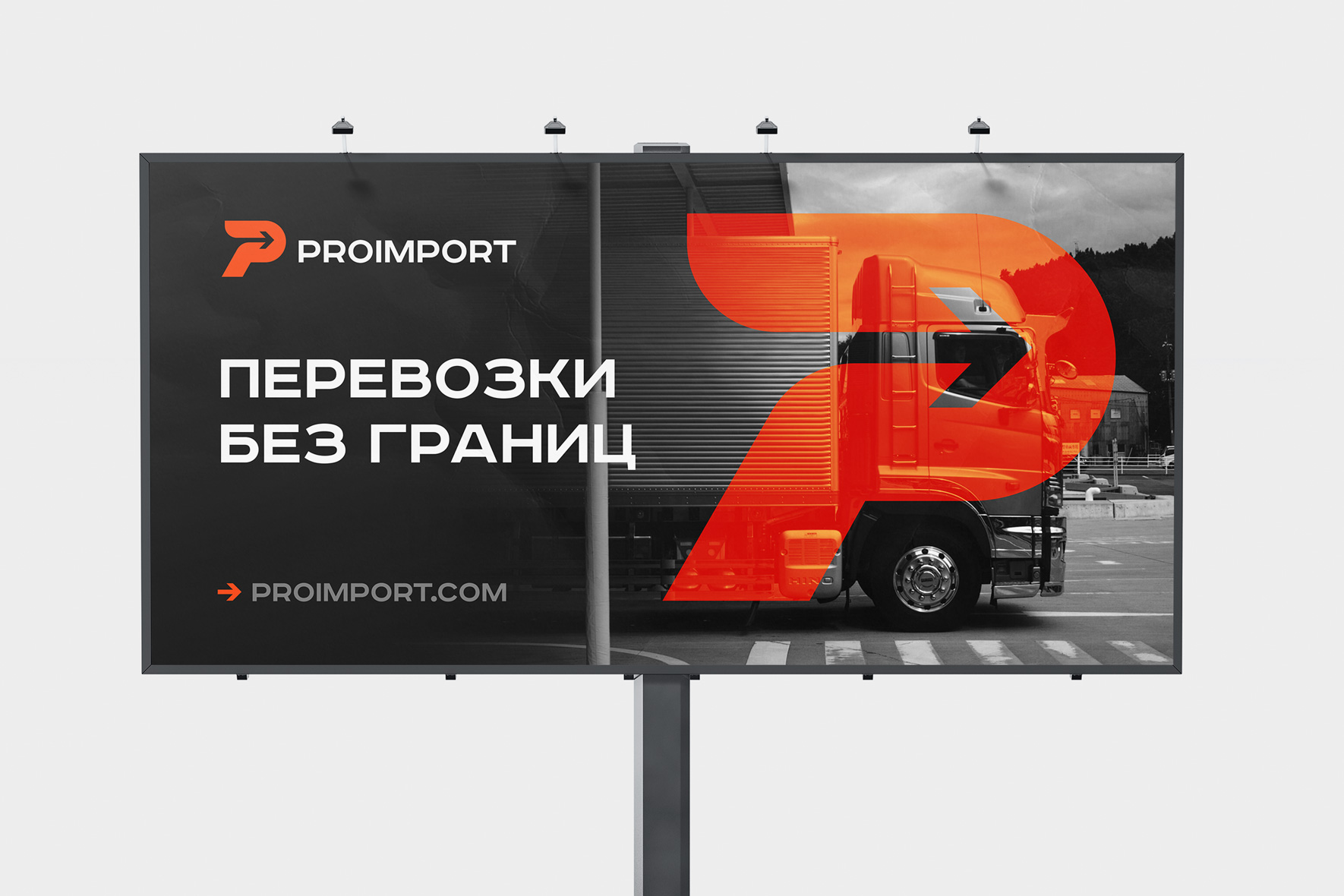
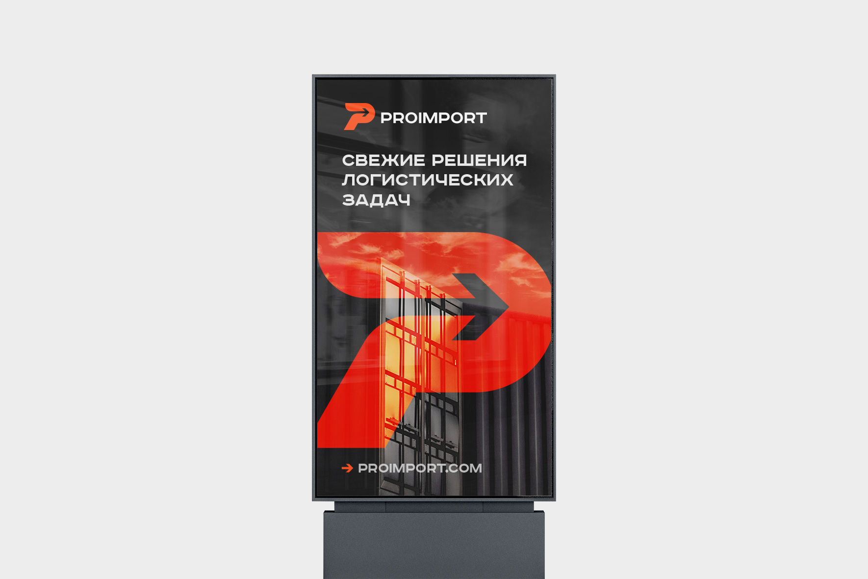
The agency developed an identity for the company, making a modern, memorable logo.
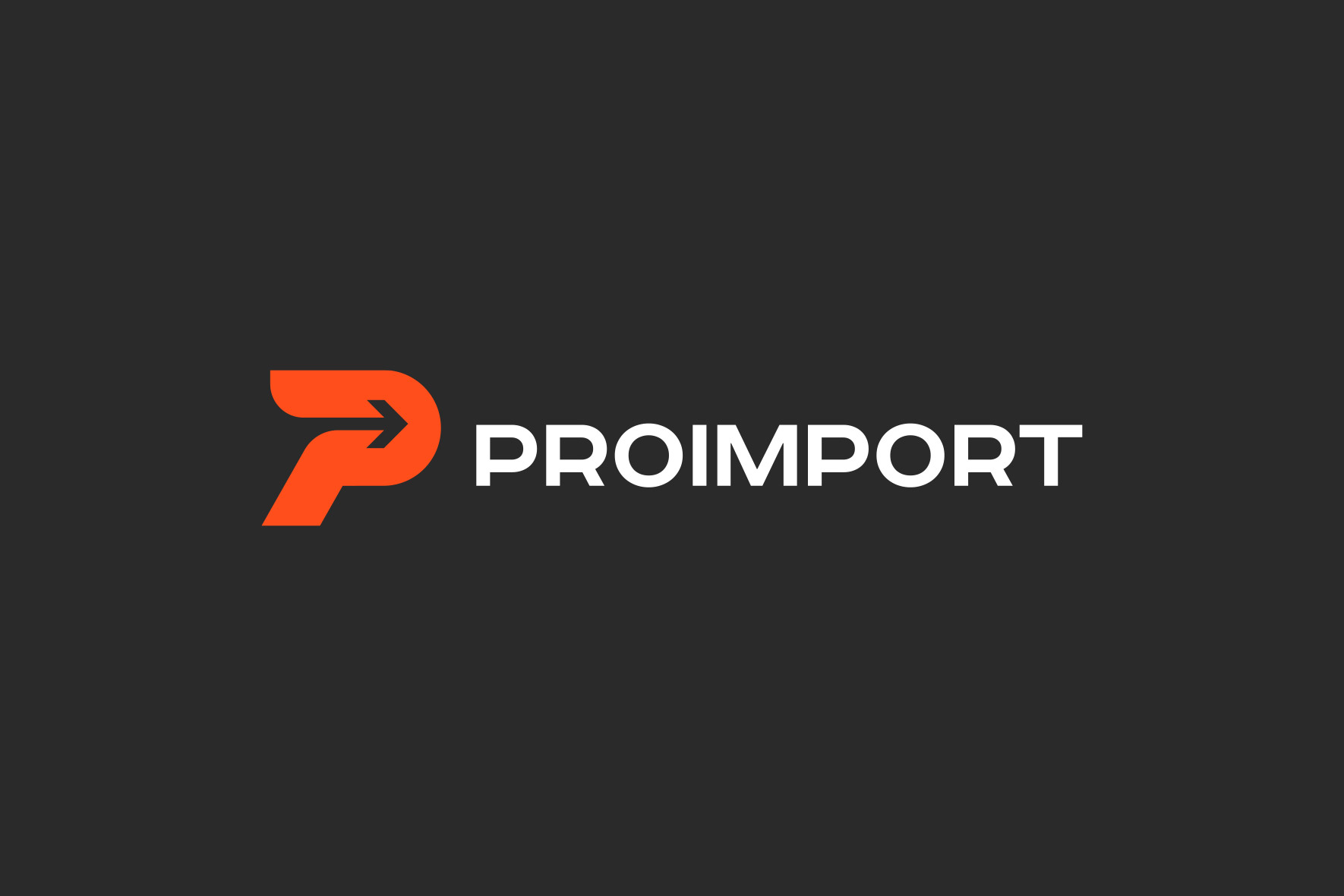
The sign combines the first letter of the name of the company and the image of the input arrow, which means entry, entry. Bright orange color combined with dark gray gives the logo character and forms the image of a technology company. A stable saturated font in the inscription reflects its reliability.
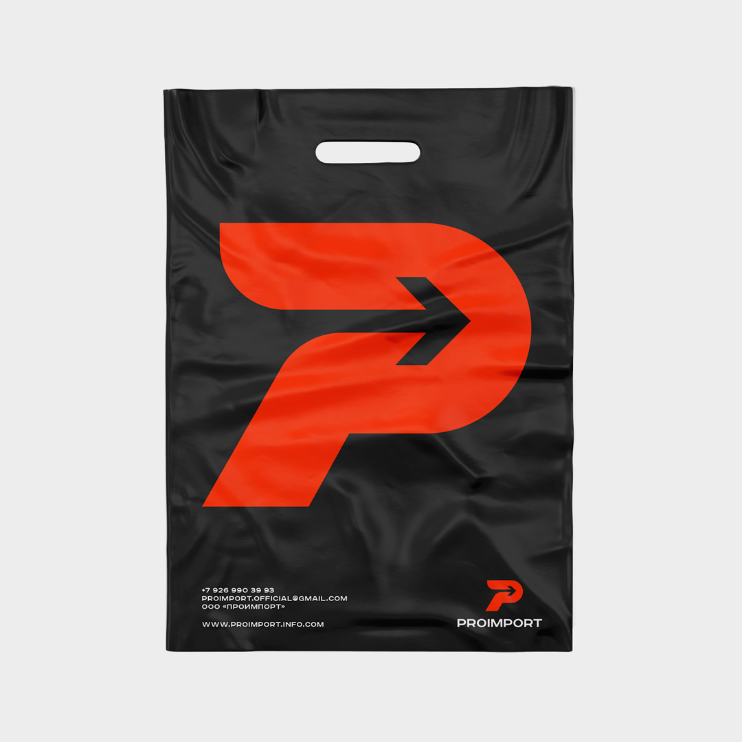

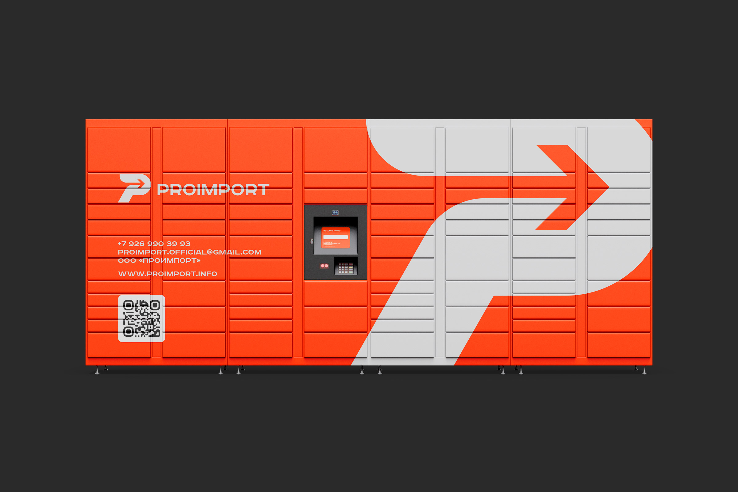
The logo is organic on a variety of media and looks good both on souvenir products and on business documents.
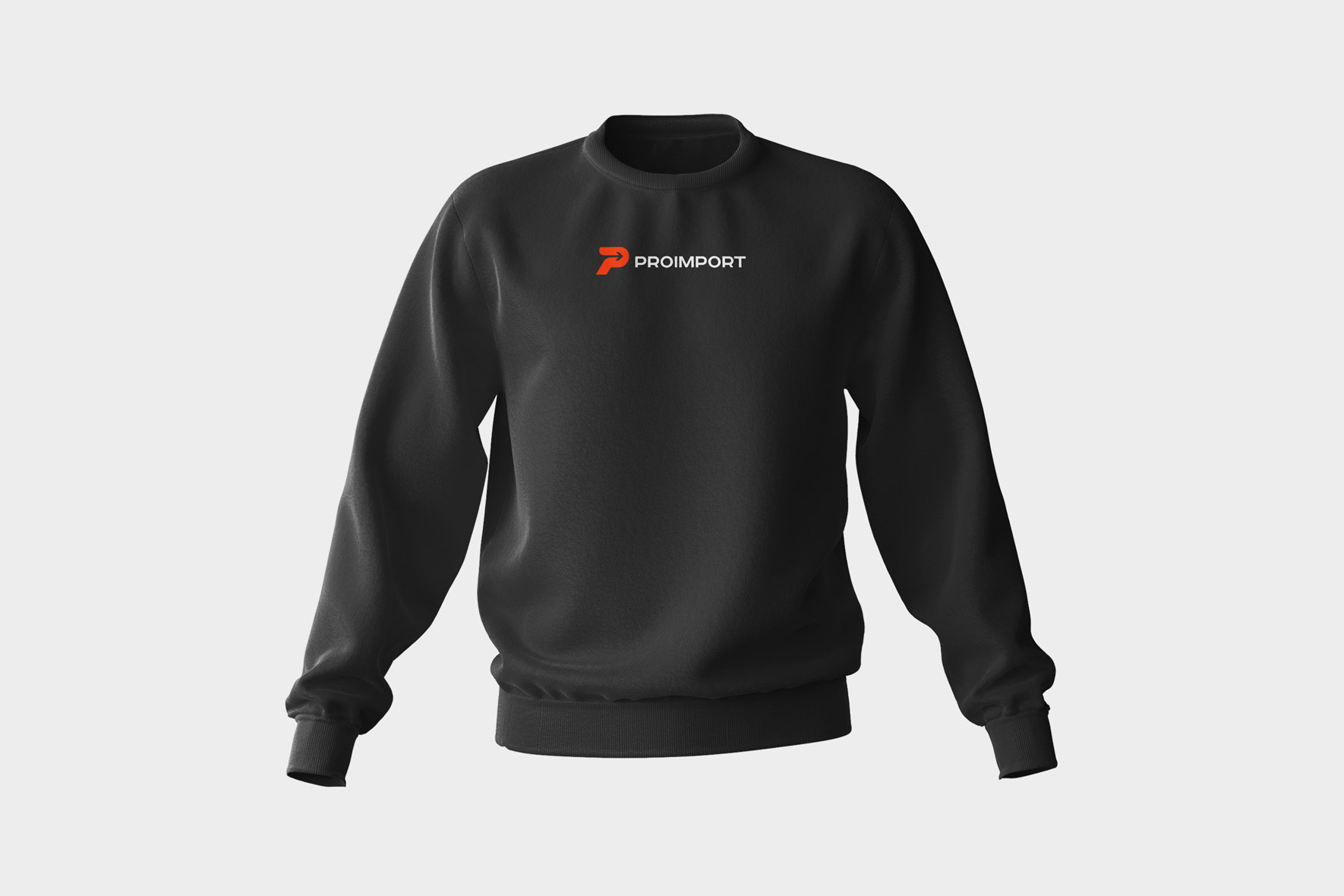
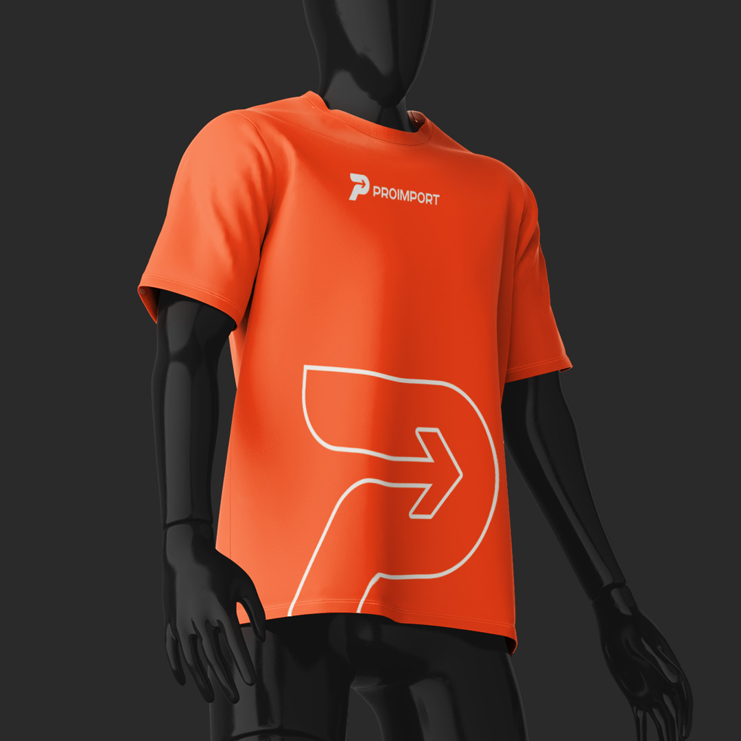

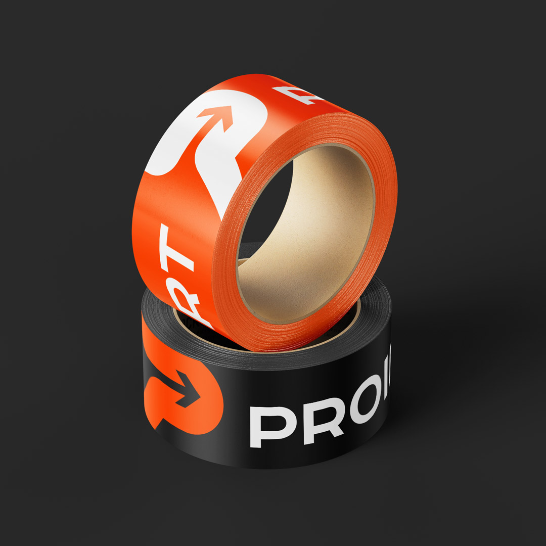
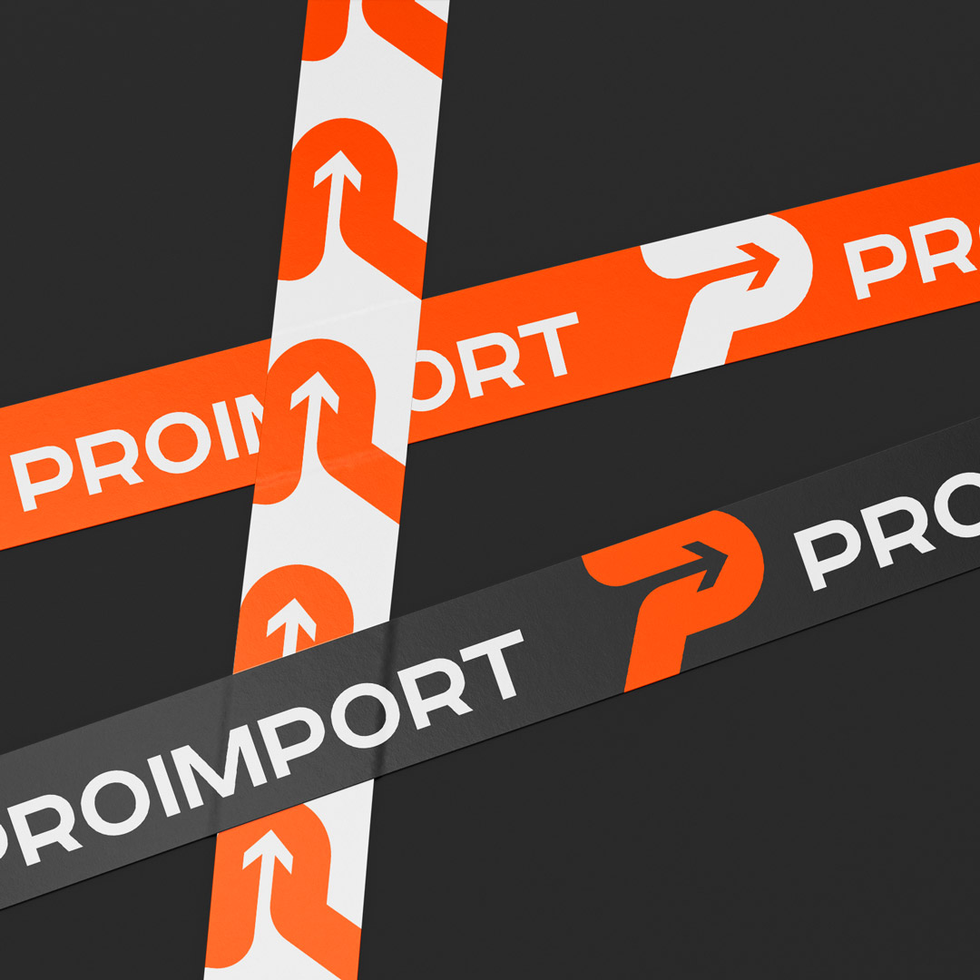
The sign can be used separately as a design element, for example, when laying out promotional materials.
The corporate site is made in the new corporate style of the company. We put it together on WordPress.
Structure and usability
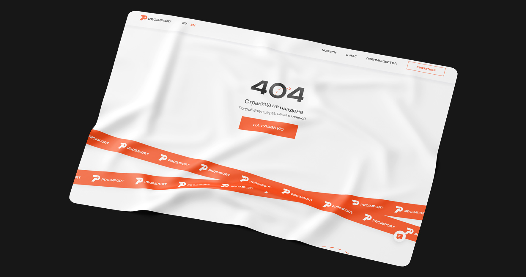
We built the structure of a multi-page site in such a way that the user is always one click away from going to any page of the site. This two-level system simplifies site navigation. In the header of the menu, we moved the section Services, About us, Benefits and a feedback button that generates leads.
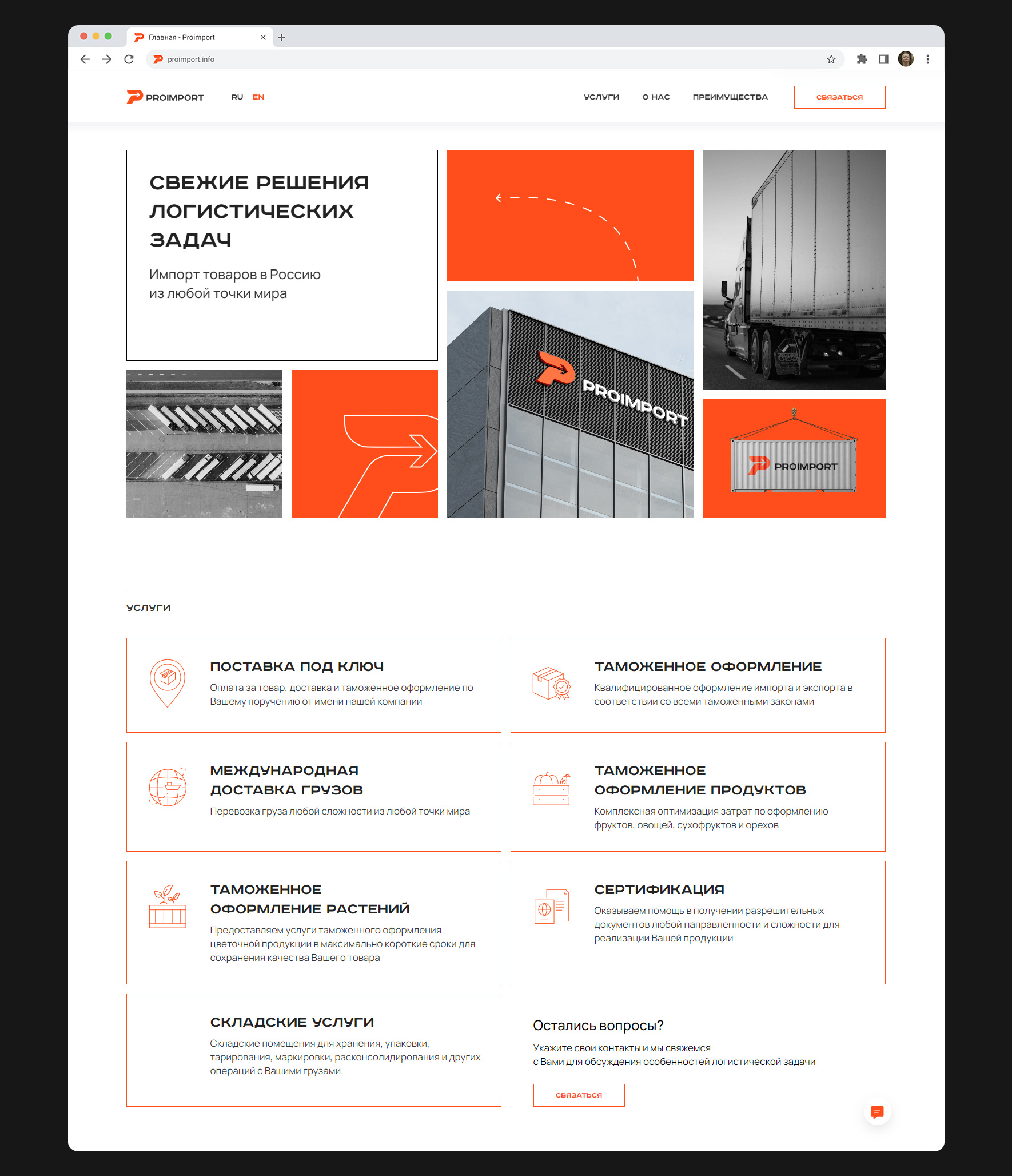
We continue and develop the image of the arrow from the logo in the list markers, illustrations and decorative elements of the site.
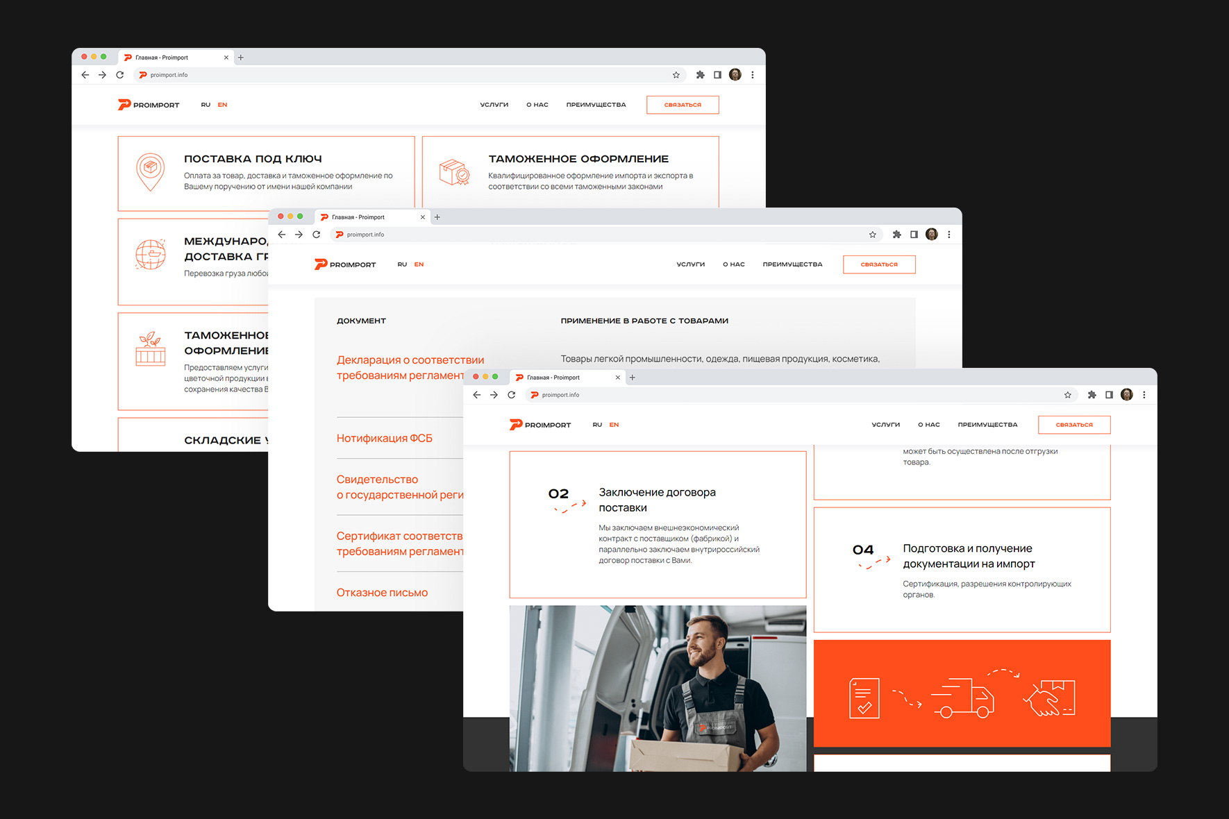
Animation
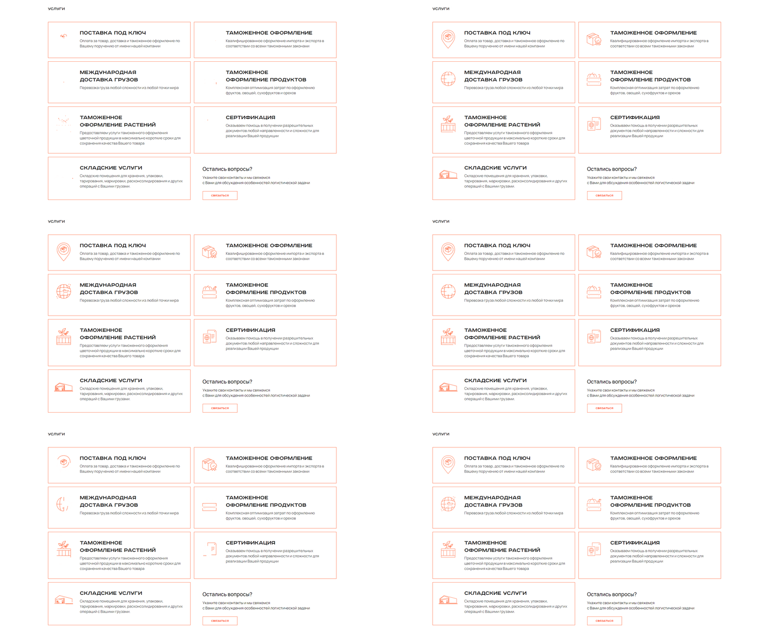
A logistics company is a movement, so we actively use animation on the site. We revived illustrations, icons and the appearance of corporate identity elements on the screen.
Client
Proimport
Services
Corporate branding
Logo
Identity
Date
January, 2023
Let's talk business
Fill out the form and we will contact you. As a rule, this happens during the working day.


